2011년 5월 31일 화요일

TKTS Booth -Time Squre New York

2011년 5월 31일 화요일

Architects: Perkins Eastman
Location: New York, USA
Project Year: 2008
Principal material: Glass
Footprint Area: 79 sqm
Stairs Area: 200 sqm
Photographs: Perkins Eastman


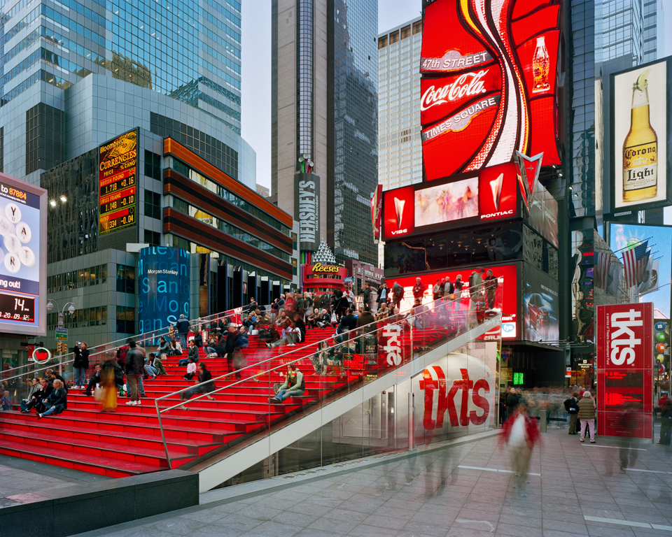
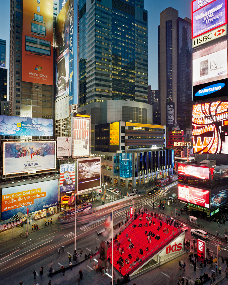
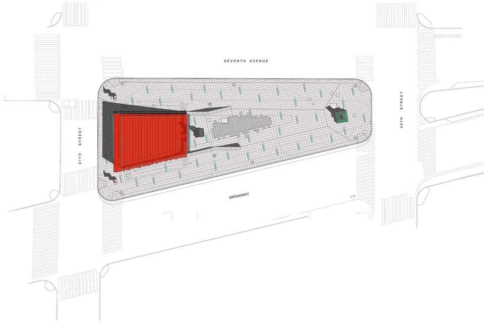
The new TKTS Booth, designed by top international architecture and design firm Perkins Eastman, responds to its location a top Father Duffy Square, a slender triangular-shaped public park in Times Square. The TKTS Booth is a combination of structural integrity and innovative design made possible with the latest advances in glass technology and the collective knowledge of the world’s leading industry experts. The new TKTS Booth is the most complex and sophisticated glass structure ever created-a show-stopping urban sculpture of iconic proportions and forward-thinking ingenuity. The firm’s network of 13 international and domestic offices provided the global expertise needed to create an elegant solution to one of the most complex design challenges inspired by the winner of the international ideas competition, Australian-based architectural firm Choi Ropiha.


As the largest architectural firm in New York, Perkins Eastman welcomed the opportunity to provide a New York City landmark institution with an iconic and permanent home. The new Booth, a discount outlet for same-day tickets to Broadway and Off-Broadway productions, is divided into two independent portions: the glass shell and structural supports, and the booth itself. While the structure evokes a delicate elegance, the complexity of the design and construction is awe-inspiring. Navigating construction amidst the congestion synonymous with Times Square is a logistical nightmare. To ease any potential impact on the project, and to expedite construction, the mechanical system, and the body of the both were prefabricated, skid mounted, and dropped into position in a matter of hours A geothermal system of five wells located 450 feet below Times Square, delivers a solution of chilled or heated water/glycol to radiant panels as well as supports the air-handling unit for the interior of the structure. The air handling system includes high efficiency filtration to improve indoor air quality for the occupants in the ticket booth and maintain a clean interior by reducing dust accumulation on the interior surfaces.


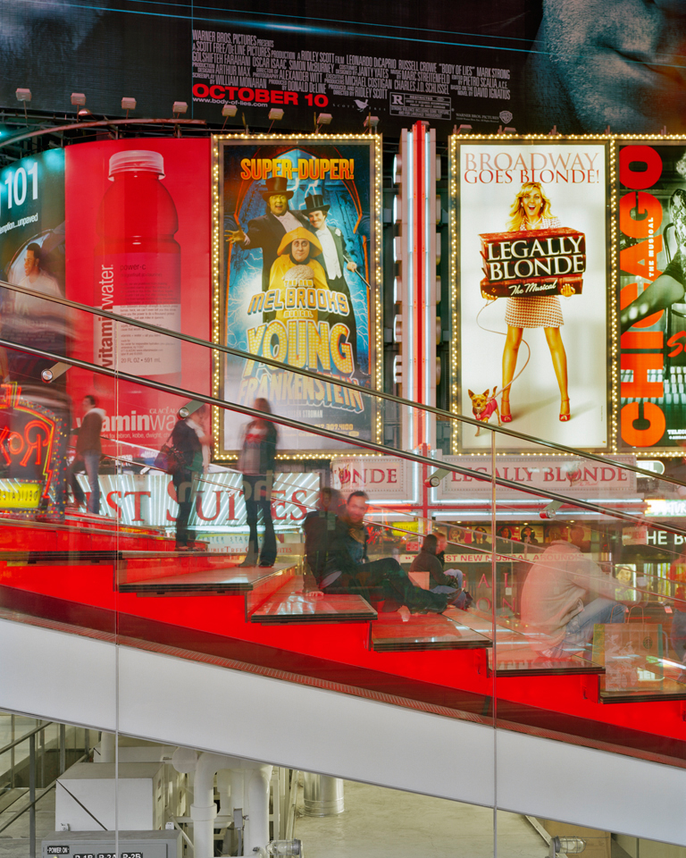
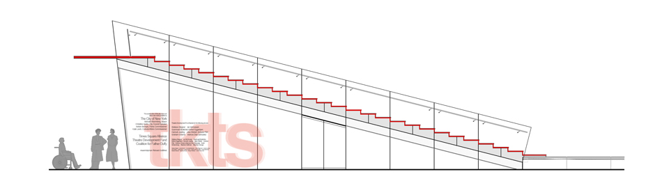
Triple-laminated heat-strengthened glass treads fabricated in Austria are illuminated by red LED lights housed below the treads. The treads are staggered and span several stringers thus providing lateral bracing for the structure. The red glass risers are removable for service access to the lights. The steps terminate in a large cantilevered canopy that protects the ticket buyers. 25 glass stringers, 28 feet long, span between glass load-bearing walls. The stringer beams comprise three double-laminated sections that are arranged on a “splice staggered” principle to maximize strength and transparency, thus minimizing the stainless steel connections. The mid-wall and north walls are constructed of 2&Prime inch thick glass panels. The north wall panels are more than 16′ tall and 6′ 10&Prime wide. Light-emitting diodes (LEDS) illuminate the structure from within and shroud the structure in a shimmering, floating carpet of color and light.


Perkins Eastman’s design was inspired by the winner of an international ideas competition, Australian-based architectural firm Choi Ropiha. The design and construction team members also include: Dewhurst Macfarlane and Partners; Schaefer Lewis Engineers; DMJM Harris; D. Haller, Inc.; iG Innovation Glass; David Shuldiner, Inc.; and Merrifield-Roberts. New York-based Williams Fellows Architects designed the plaza.
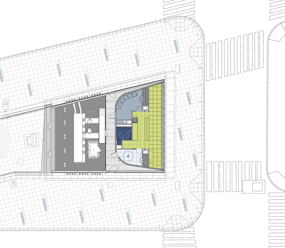

0 개의 댓글

건축과 해체. Architecture and Disjuction


“행위가 없다면 건축은 존재하지 않으며, 이벤트와 프로그램이 없다면 건축 또한 존재하지 않는다.”


근대건축이 기능적인 요구조건에 대한 충족을 통해 관념적인 공간의 개념을 이해했다면 츄미는 공간에서의 사건을 중심으로 행위와 공간의 상호관련성안에서 작동성을 통해 공간을 이해하려했다


- Posted using BlogPress from my iPad

0 개의 댓글

2011년 5월 30일 월요일

11 Parallels Between Architecture and Interface Design

2011년 5월 30일 월요일


  1. Start with the context. For Architects, a project begins with a site analysis to evaluate the available space, direction of the sun and wind, characteristics of surrounding buildings, street patterns and other environmental factors that need to co-exist with the building. The parallel in interface design is considering the context of users: What is their typical workflow? What other data and reporting are they working with? What decisions will be made from viewing the data? What is their skill level?


  2. Decipher client needs The ultimate job of the architect and interface designer is to translate vague but strongly-held desires of the client into a practical reality. There are straightforward functional requirements: “I need a house with three bedrooms upstairs.” And there are more subtle demands: “The application needs to be simple enough for anyone to use.”


  3. Evolved toward reality. It wasn’t hard to find parallels in the ways that we approach the process of designing. Like interface design, the architectural design process evolves from the most abstract (blocks of wood) to more realistic representations (drawings and models). The more realistic the format, the more time intensive and the more clearly the concept and details can be communicated. At Juice, we are particularly fond of prototyping analytical applications because it gives our clients an opportunity to engage with the interface and data directly.


  4. Build a narrative. Like any piece of art, a building needs a core story that characterizes its essential qualities. In our interface designs, we call these design principles. These are the basic truths that we want to permeate the application. Here’s an example of design principles for a reporting application design:


a) You’re one click away from what you need; b) Allow lightweight, temporary ways of paying attention to something; c) Alerts are so important that they are always visible


  1. Connected whole. I shared with my sister-in-law a description of how many dashboard vendors are essentially selling functional pieces without offering guidance on how they fit together. She remarked: “if you designed a building that way, you’d end up entering into the bathroom.” I’ve seen dashboards that feel about like that. Architecture has had many decades to recognize the primacy of the cohesive whole. Interface design, particularly when it comes to the presentation of data, hasn’t come nearly so far.


  2. Multiple relationships. Designing a building requires thinking about the problem from many different perspectives, and ensuring that the answers work together. Architects need to consider how functional spaces relate to each, how the spaces flow together, and how the spaces relate to the site. Interface design requires thinking about how the presentation of information links together, how users navigate between this information, and how the results fit into the broader user workflow.


  3. Multiple scales. Architectural and interface design requires viewing the problem at multiple scales. There is the high-level view of how a building fits into its site locations all the way down to the design of specific rooms and spaces. Each of these scales needs to be in harmony.


  4. Facilitate flow. A good design supports intuitive pathways within the structure. The design accounts for the most common use cases and makes solving these use cases obvious. In our work, we always want users to have a sense of where they are and where they can go.


  5. Iconic elements. My sister-in-law described iconic elements as the center-point of the building design and narrative. They encapsulates the personality and essence of the design. I hadn’t previously thought of interface design in this respect, but I will in the future. In our work, there is frequently a single element, whether it is a data visualization or navigational structure, that is the core of the application.


  6. Visual vocabulary. The “vocabulary” of the building represents the materials (e.g. wood, metal, glass) and other visual elements that compose the common aesthetic for the design. The analogy for us is the UI style guide where we define the color palette, typography, and other treatments that make up the look-and-feel of the interface. An effective UI style needs to align with the narrative and design principles described above.


  7. Upholding and breaking rules. There are many conventions and expectations that shape the design of a building or an interface. These rules exist for many valid reasons, and we agreed that it is important to acknowledge and respect them. However, my sister-in-law noted that her professors would often challenge students to “break the rules to make them stronger.” There are times to challenge convention, in particular with your iconic elements, to push the design beyond the ordinary and formulaic.

0 개의 댓글

Massive Change

We will Build a global mind !!


기술을 통한 Local 과 Global의 관계 재해석

올림픽이라는 Game 의 물리적(Physical) 경쟁을 통한 Globalization 현상과 기술을 통한 정보 개념의 가상적인(Vertual)인 연결을 통한 인류라는 단일 개념의 재확인 작업


0 개의 댓글